
Nine years ago, we founded NSS with a simple conviction: that companies deserve a legal and tax team that understands the pace of the real world. Since then we have grown, evolved and expanded what we do - without our image fully reflecting it.
Today that changes.
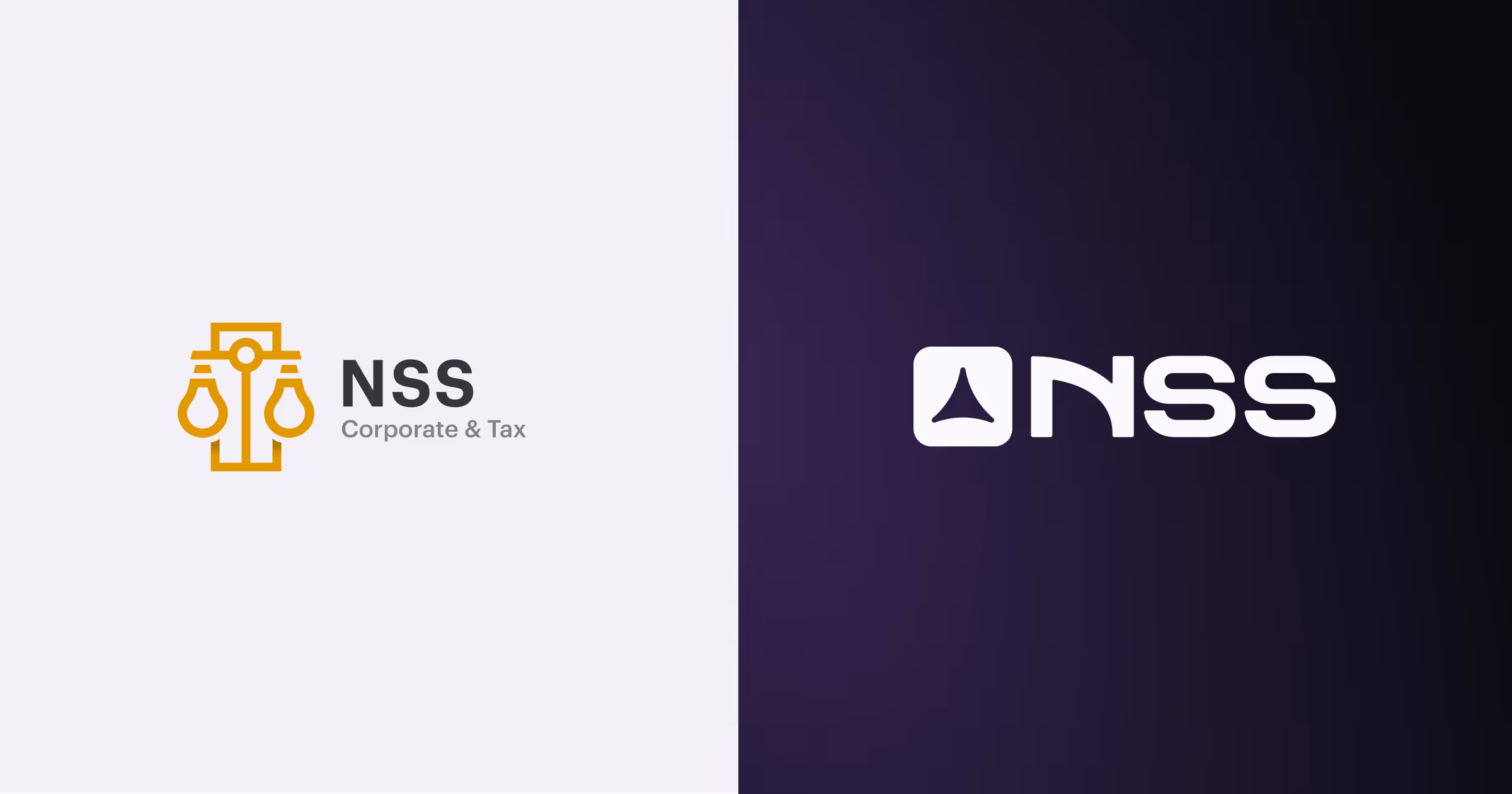
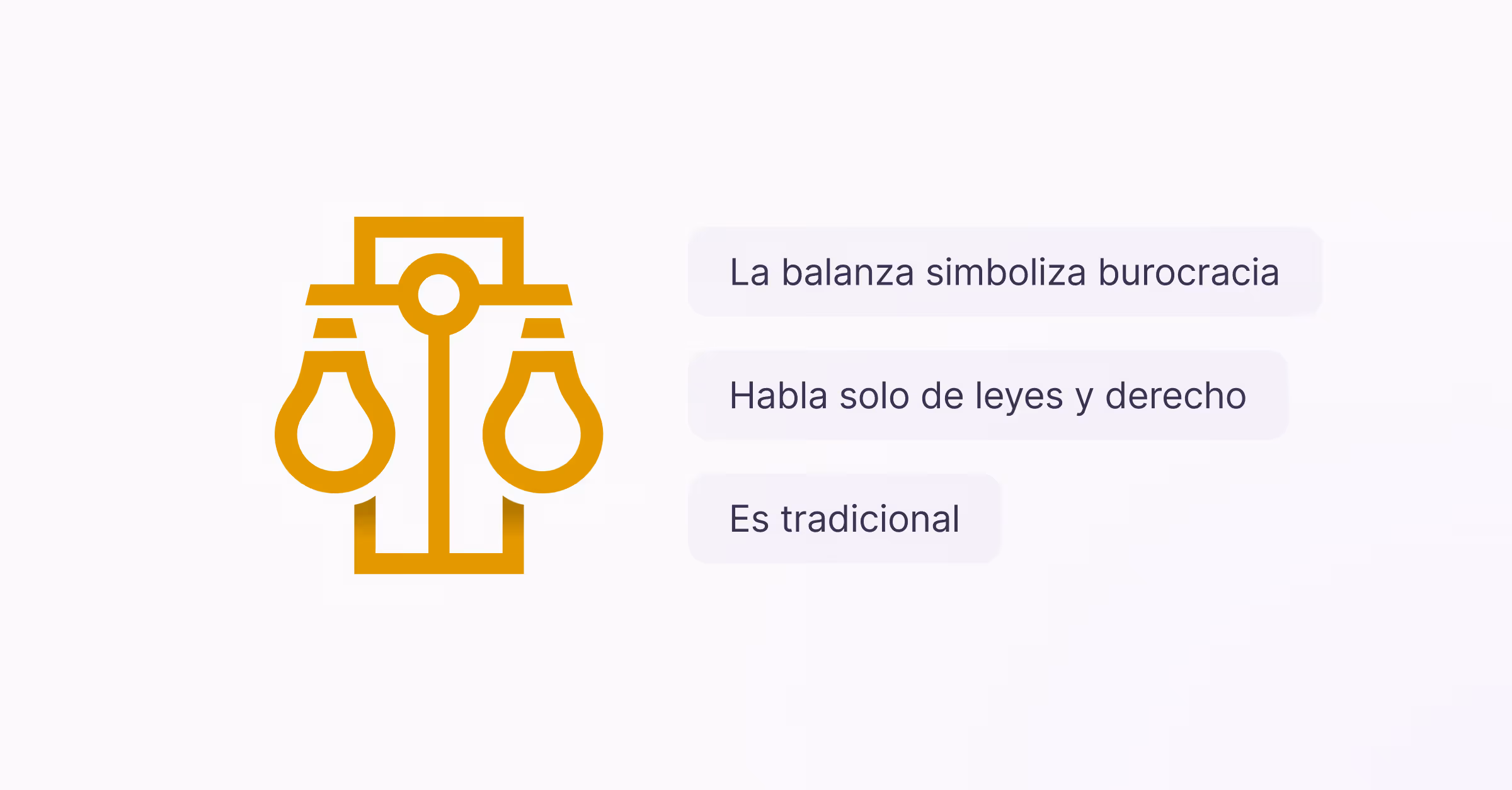
For years, our brand carried a scale with a wink of light bulbs in reference to business ideas. The scale is the classic symbol of law, and it made sense at the time. But NSS stopped being a traditional law firm a long time ago.
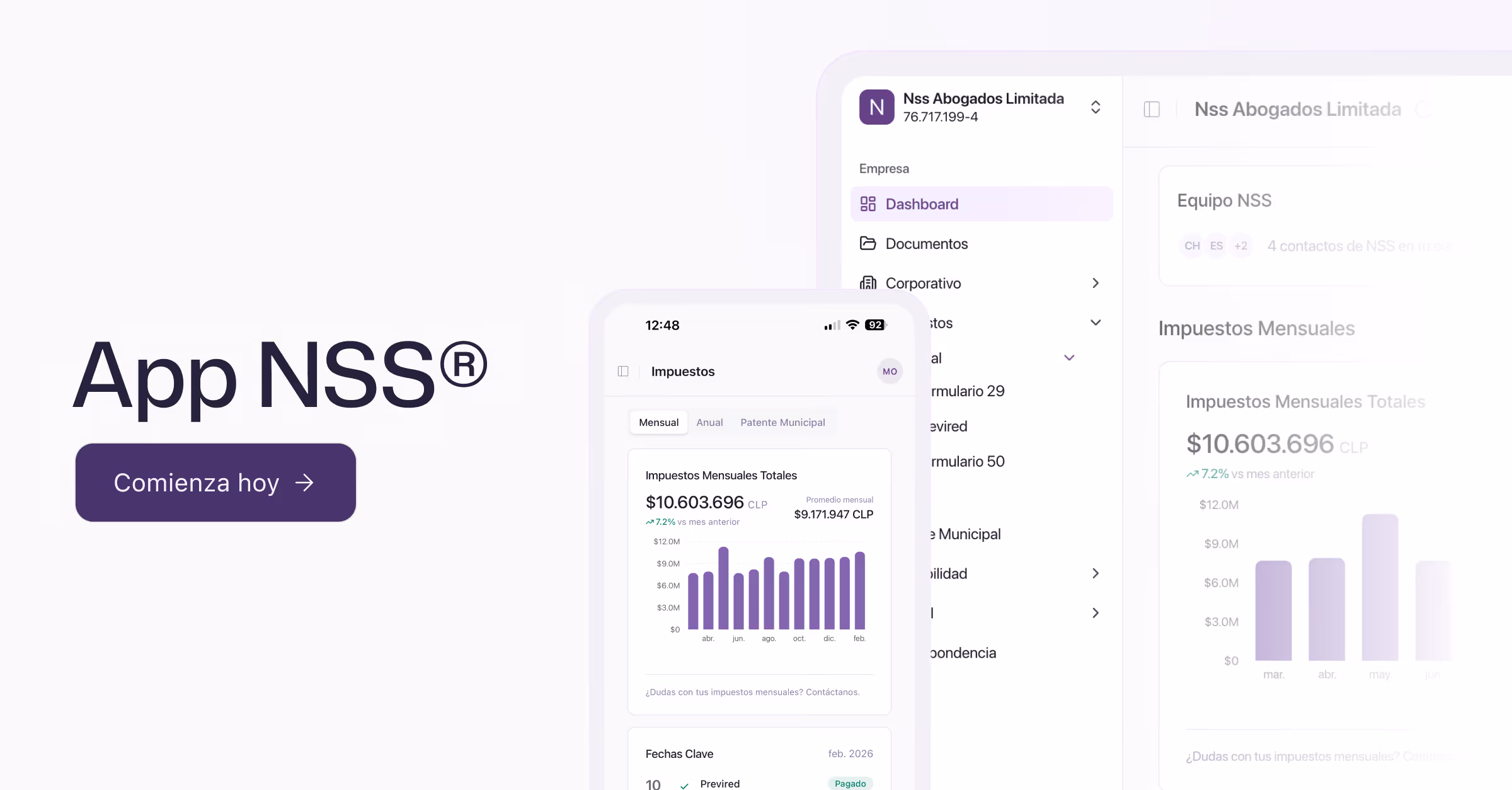
Today we are a legal, tax, accounting and technological infrastructure for entities that operate to high standards. We have a digital platform. We have a multidisciplinary team. We have customers on every continent.
The scale was no longer enough to deference us. It was time for a brand that did.
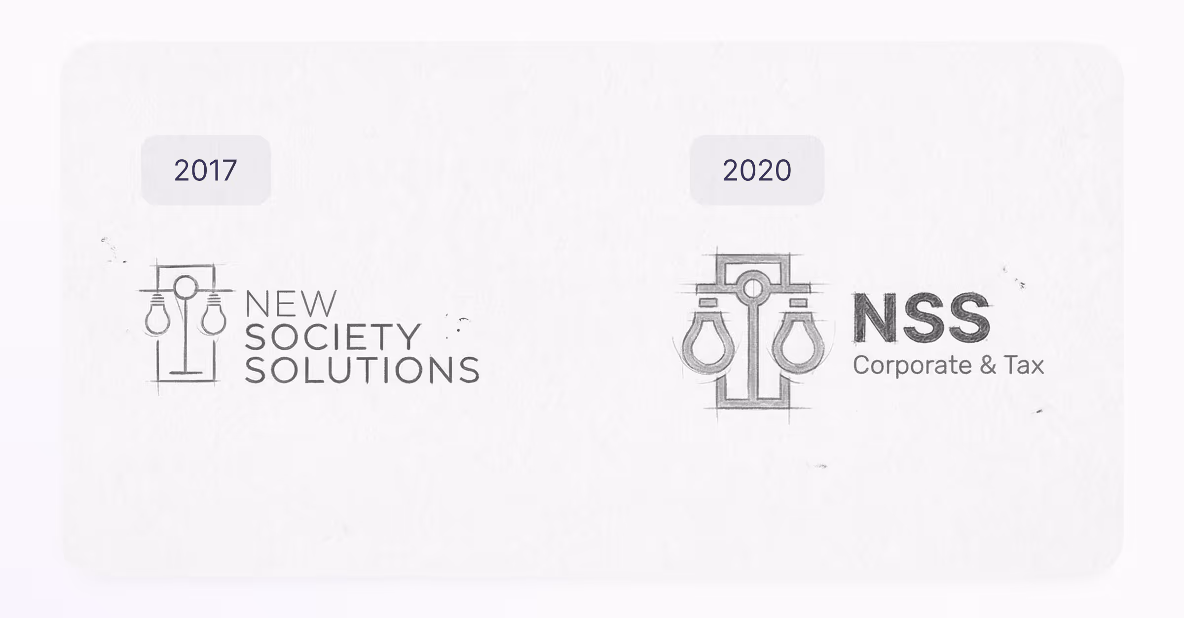
Designing and defining a new brand is no easy task. Our last rebranding was in 2020 when we decided to upgrade our first brand, making a transition from a finer scale to a stronger and firmer piece, three years after its inception.
For this challenge, we were clear about what we needed to convey — precision, direction, ecosystem — but finding a way to summarize all this, without going literally, took time and several iterations.
During the design process, an objective was defined and that was that the new isotype of our brand had to meet three conditions:
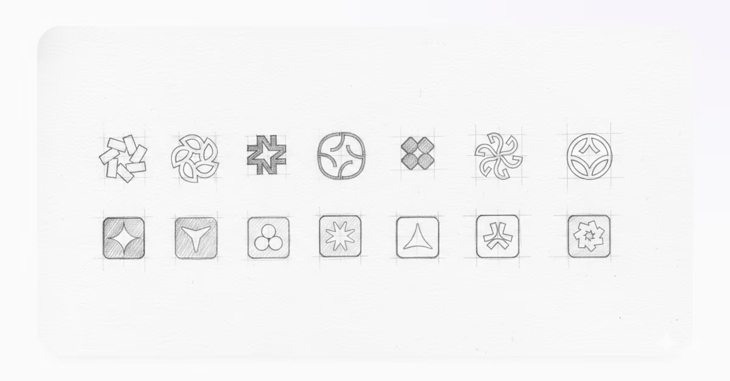
Different paths were tried to reach this point of convergence. We tried to recover some forms of the old logo, we deconstructed the ampoule of our scale, but the results were complex and full of information.
In one part of the exploration process, he emerged with a clear figure that made sense with what we wanted to communicate: An expanding delta, a three-pointed figure that points up and forward, contained in a rounded square. Precise movement. No unnecessary decoration.

Since 2017, NSS has come a long way under the same three letters. Three acronyms that today undergo a second process of rebranding and an expansion that led us from offering services to Chilean entrepreneurs to becoming a strategic partner of more than 100 companies from all continents to operate in Chile with us. All of this happened under the name NSS — and yet, at the design level, our brand didn't have the leading role it deserved.
For this rebranding, it was important to resolve a clear and memorable isotype, but it was also equally important to resolve the wordmark. We couldn't reach the age of 9 with letters that didn't measure up to what we are today. We needed a renewed, modern wordmark with enough character to face the future — without having to sit down and redesign it in a few years.
The result is a geometric typography, with a firm line and its own personality. Capable of even operating independently.

As of today, our identity is NSS | Legal & Tax. The name is the same but what changes is how we present it to the world.
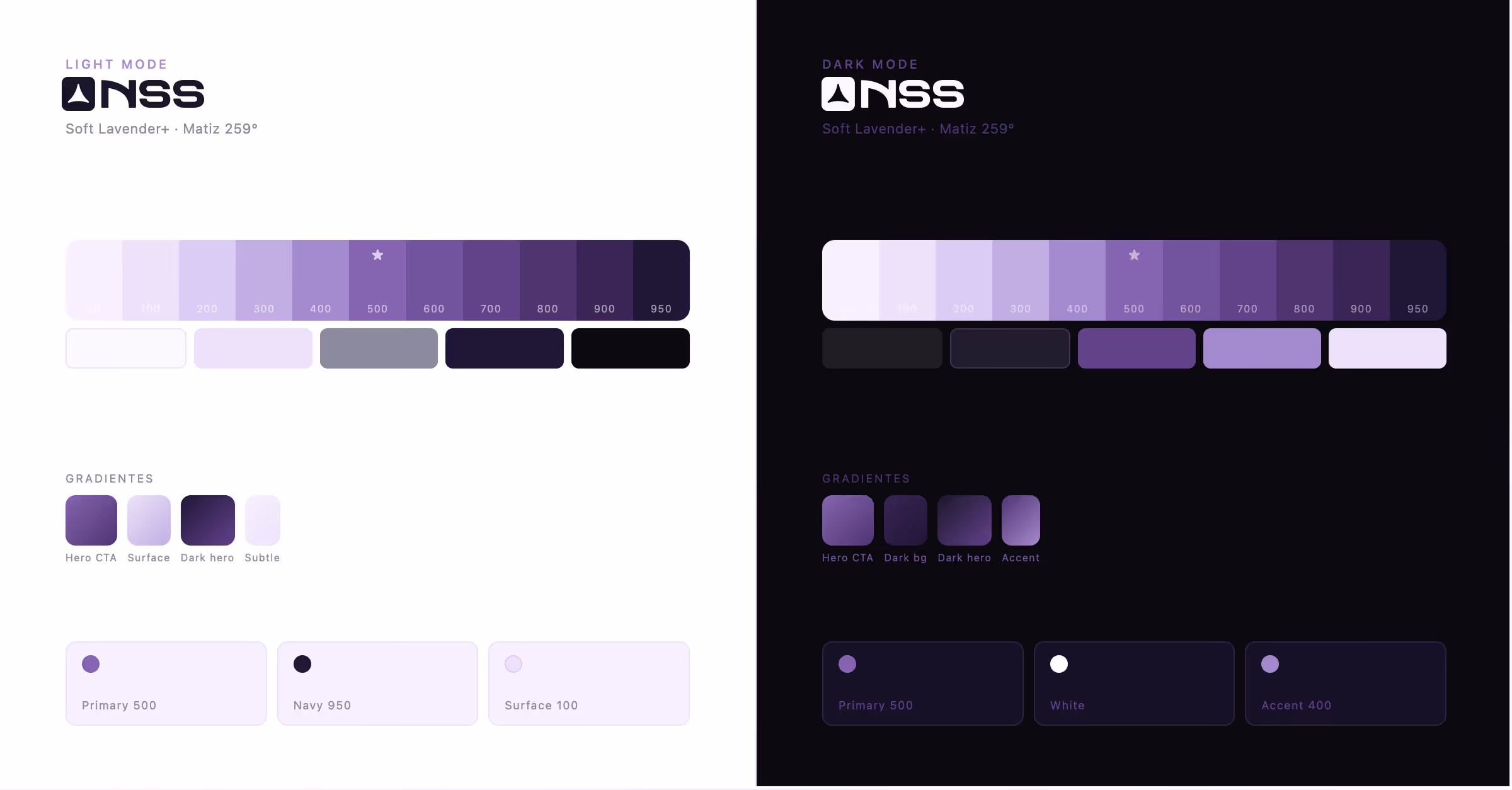
Our previous palette was based on two main colors: a burgundy/purple and the gold of the scale. On paper and in physical presentations, they worked well — they conveyed elegance, sobriety and authority. Exactly what is expected from a law firm.
The problem is that our main points of contact with customers are no longer physical. They are our website, the NSS® apps, contracts and digital presentations. And in those environments, both colors failed. Bordeaux lacked the contrast and personality necessary for a digital ecosystem in constant motion.
Gold, on the other hand, is one of the most complicated colors to meet minimum accessibility standards — which is why it ended up confined to the logo and could never be used consistently in the rest of the identity.
This is why we designed a color palette that we named Soft Lavender+: a purple system built from scratch for digital living. We evolved from a burgundy/purple to a family of shades that range from the softest lavender to the deepest navy, through the purple that today defines NSS on every surface where we appear.
Before proceeding, the most important thing: nothing changes in your relationship with NSS.
Their contracts are still valid. Their team remains the same. The services they contracted are maintained and strengthened. What evolves is how we deliver them — more integrated, more digital, with a higher standard of compliance through our team and our NSS® apps.
However, if you have any questions about our rebrand, our team is available to answer them.
The new identity reflects something that was already real: in NSS, work is human. It is our lawyers, accountants and advisors who manage each case with judgment and experience. What we have built - and continue to build - is our own technology that makes that work more visible, more accessible and more efficient for each customer. Our NSS® App is the first piece, but more are coming.
Starting today you will find us as NSS | Legal & Tax on all our platforms:
This change isn't just aesthetic. It is the reflection of 9 years of work, of accumulated trust and of a team that decided to continue growing with intention.
Thank you for trusting us. We're still the same — with an image that finally proves it.
The NSS team.